Plotting physt histograms
Some matplotlib-based plotting examples, with no exhaustive documentation.
[1]:
# Necessary import evil
import physt
from physt import h1, h2, h
from physt.plotting import matplotlib
import numpy as np
import matplotlib.pyplot as plt

np.random.seed(42)

from physt import plotting
[2]:
# Some data
x = np.random.normal(10, 1, 10000)
y = np.random.normal(10, 10, 10000)
[3]:
ax = h2(x, y, 15).plot(figsize=(6, 6), show_zero=False, alpha=0, text_color="black", show_values=True, cmap="BuGn_r", show_colorbar=False, transform=lambda x:1)
h2(x, y, 50).plot.image(cmap="Spectral_r", alpha=0.75, ax=ax)
[3]:
<Axes: >

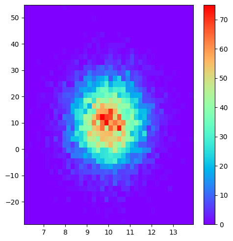
[4]:
h2(x, y, 40, name="Gauss").plot("image", cmap="rainbow", figsize=(5, 5))
[4]:
<Axes: >
[5]:
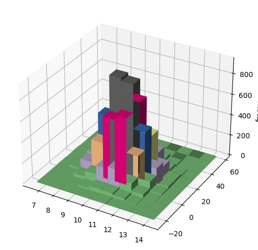
plotting.matplotlib.bar3d(h2(x, y, 10, name="Gauss"), figsize=(5, 5), cmap="Accent");
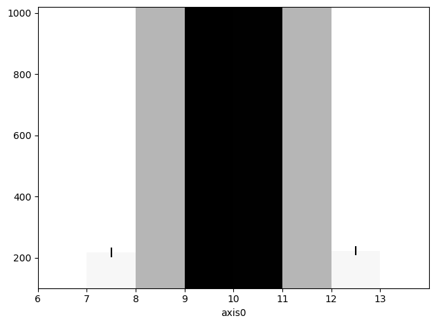
[6]:
h1(x, "pretty", bin_count=10, name="Gauss").plot(ylim=(100, 1020), cmap="Greys", ticks="edge", errors=True);
[7]:
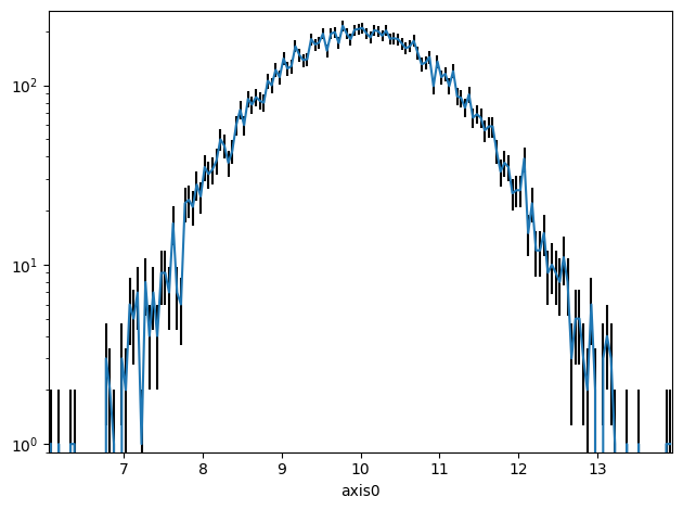
h1(x, "pretty", bin_count=200, name="Gauss").plot.line(errors=True, yscale="log")
[7]:
<Axes: xlabel='axis0'>
[8]:
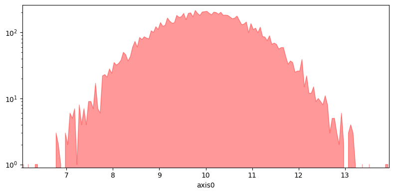
h1(x, "pretty", bin_count=200, name="Gauss").plot.fill(lw=1, alpha=.4, figsize=(8, 4))
h1(x, "pretty", bin_count=200, name="Gauss").plot.fill(lw=1, alpha=.4, yscale="log", figsize=(8, 4), color="red")
[8]:
<Axes: xlabel='axis0'>

[14]:
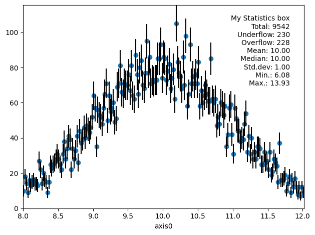
h1(x, "pretty", bin_count=200, name="Gauss", range=(8, 12)).plot.scatter(errors=True, show_stats="all", stats_loc="upper right", stats_title="My Statistics box")
[14]:
<Axes: xlabel='axis0'>
[10]:
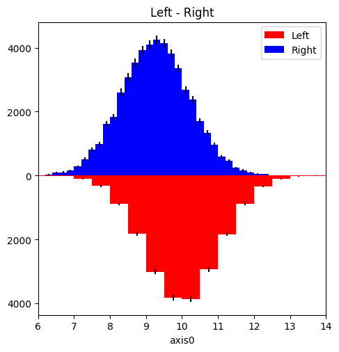
ha = h1(x, "pretty", bin_count=20, name="Left")
hb = h1(x - 1 * np.sin(x / 12), "pretty", bin_count=40, name="Right")

from physt.plotting.matplotlib import pair_bars
[11]:
ha.statistics
[11]:
Statistics(sum=99978.64016631573, sum2=1009641.2095046707, min=6.077599748381658, max=13.926237706436327, weight=10000.0, median=9.997405024207122)
[12]:
pair_bars(ha, hb, density=True, errors=True, figsize=(5, 5));
/home/jan/code/my/physt/src/physt/histogram_base.py:391: UserWarning:

Negative frequencies in the histogram.

/home/jan/code/my/physt/src/physt/plotting/matplotlib.py:810: UserWarning:

set_ticklabels() should only be used with a fixed number of ticks, i.e. after set_ticks() or using a FixedLocator.
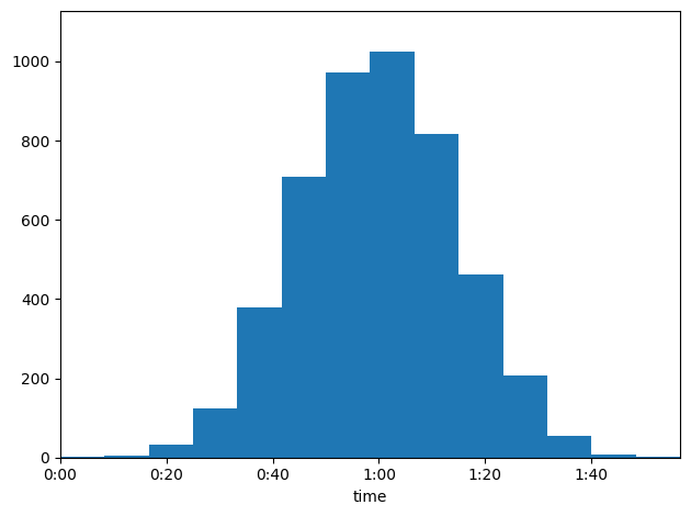
Example - histogram of time values
[13]:
# Get values close to
from physt.plotting.common import TimeTickHandler

data = np.random.normal(3600, 900, 4800)
H = h1(data, "pretty", axis_name="time")
H.plot(tick_handler=TimeTickHandler())
[13]:
<Axes: xlabel='time'>